Skeuomorphs
The 5th page of Ars Technica’s Mac OS X 10.7 Lion review by John Siracusa “Here’s to the crazy ones” covers the GUI appearances of Apple’s iCal and Adress Book software — extreme examples of metaphorical design. Both applications imitate real/paper objects by all means and in every pixel available.
The author talks about them as skeuomorphs, “derivative object[s] that retain ornamental design cues to a structure that was necessary in the original[s]”, as defined by OED. It is of course possible to see iCal in the row of classic skeuomorphs, as Siracusa and the Wikipedia article do, adding it to the row of decorative but ultimately useless rivets or wheel covers.
But following this logic we’d have to say that all metaphoric (not idiomatic) elements of user interfaces are skeuomorphic, because their only function is to remind about older days, or better to say, a pre-computer experience. And then it is not interesting anymore.
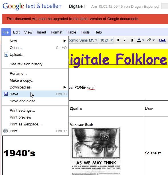
What would be really interesting instead is collecting authentic digital skeuomorphs, which in my understanding would be original (idiomatic) interface elements that are still used in current interfaces without being functional. The first example that comes to my mind is the “save” button in applications that do save automatically, like in the classic version of Google Docs.
What else? It is not easy to find examples, because of two reasons:
- Interface skeuomorphs are more about functions than aesthetics.
- The idea to keep elements from a digital past is not mainstream.
Leave a Reply